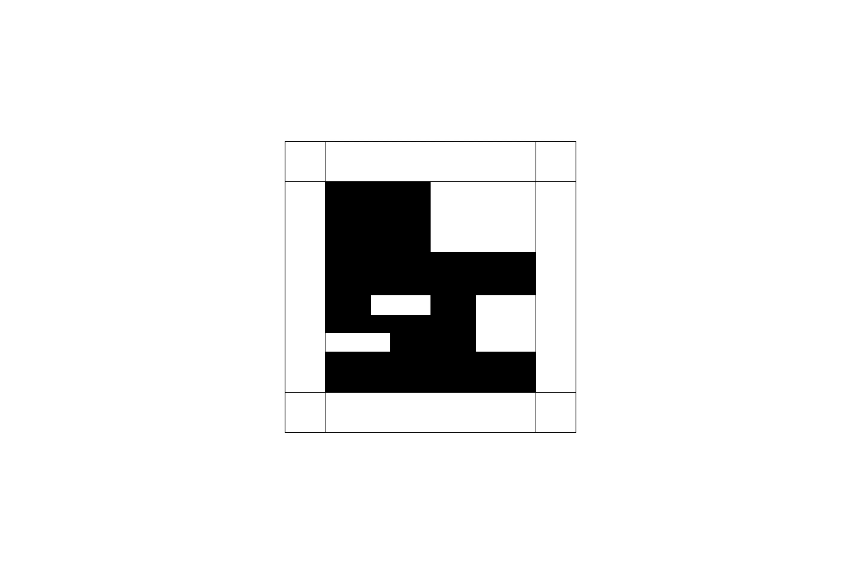
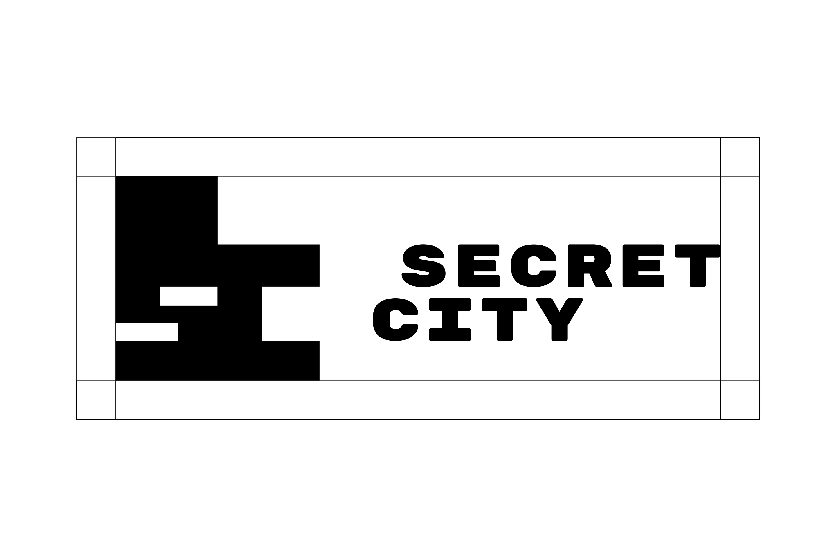
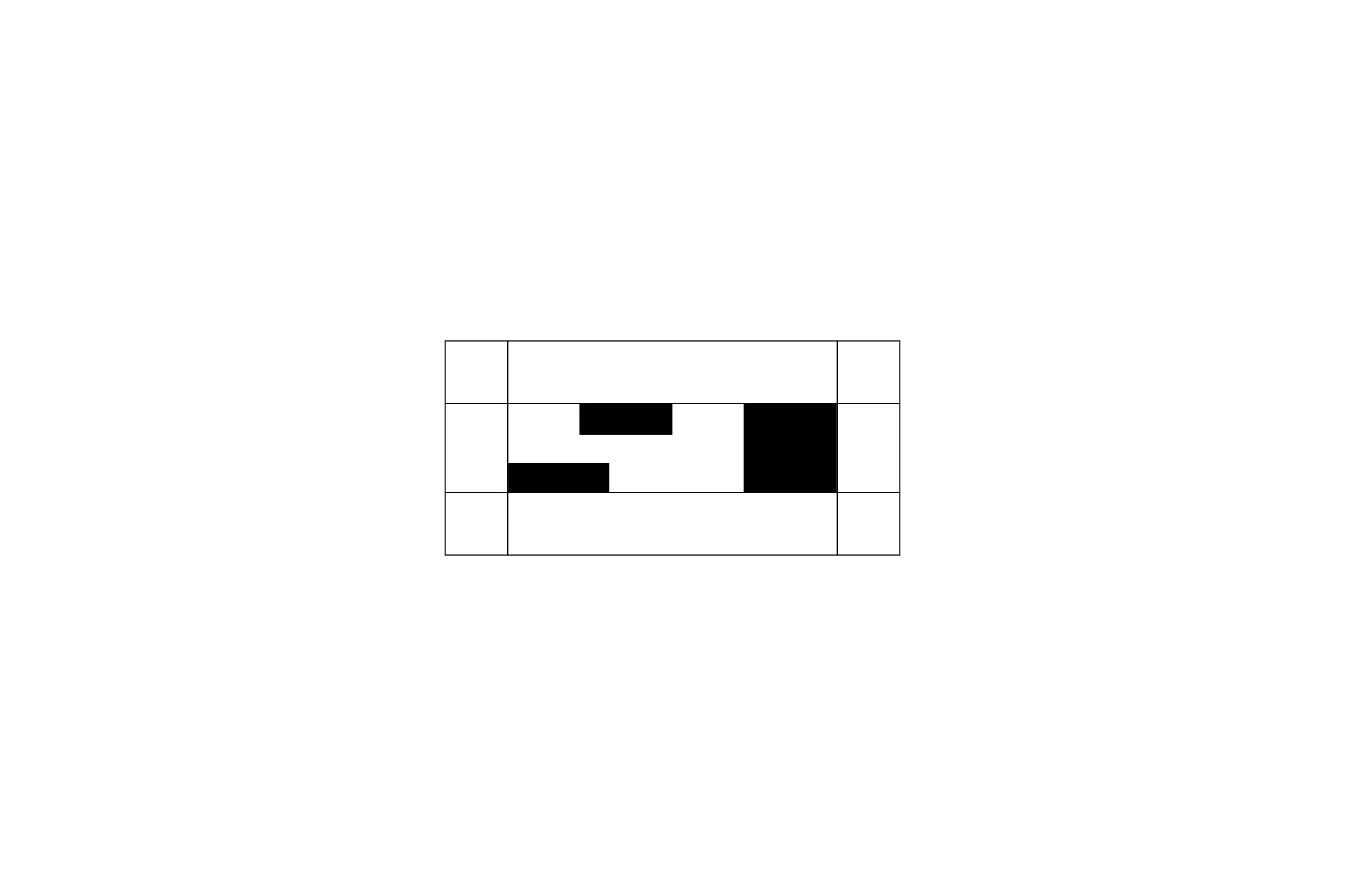
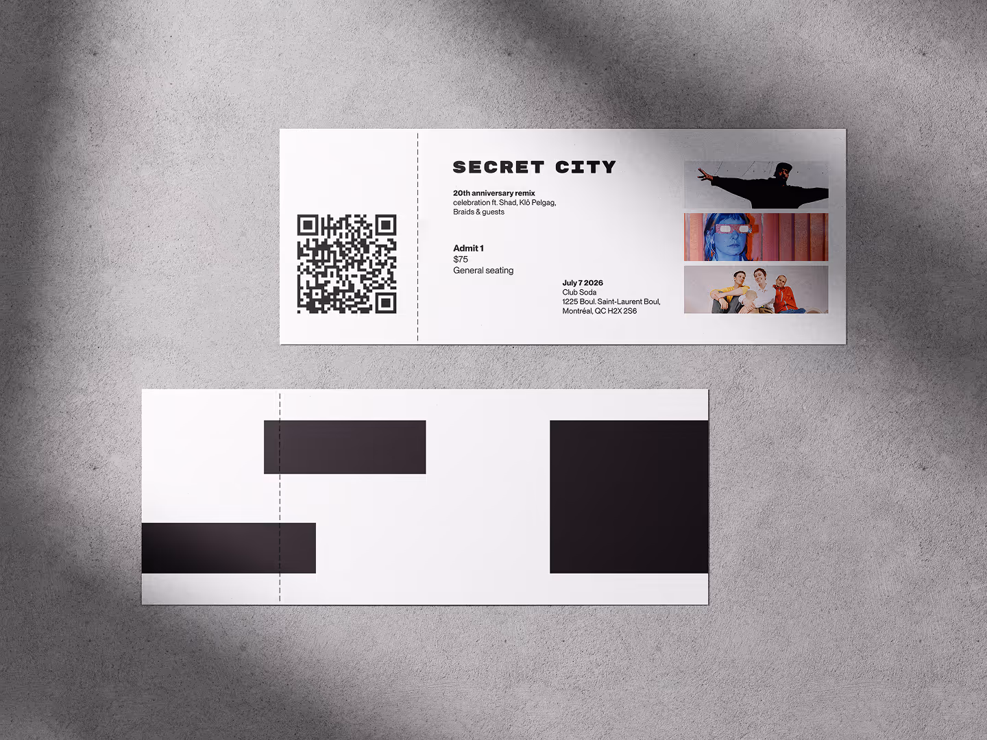
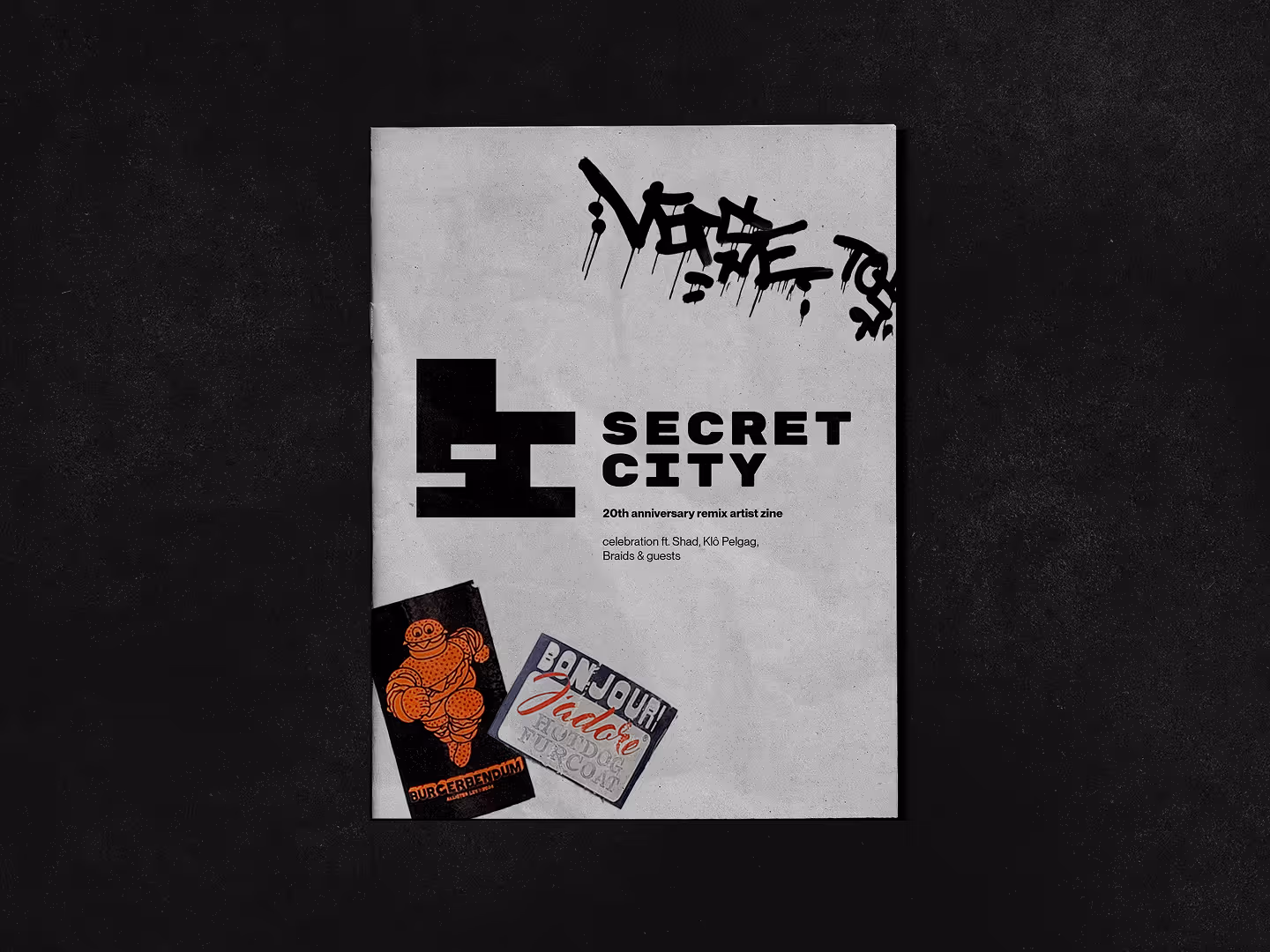
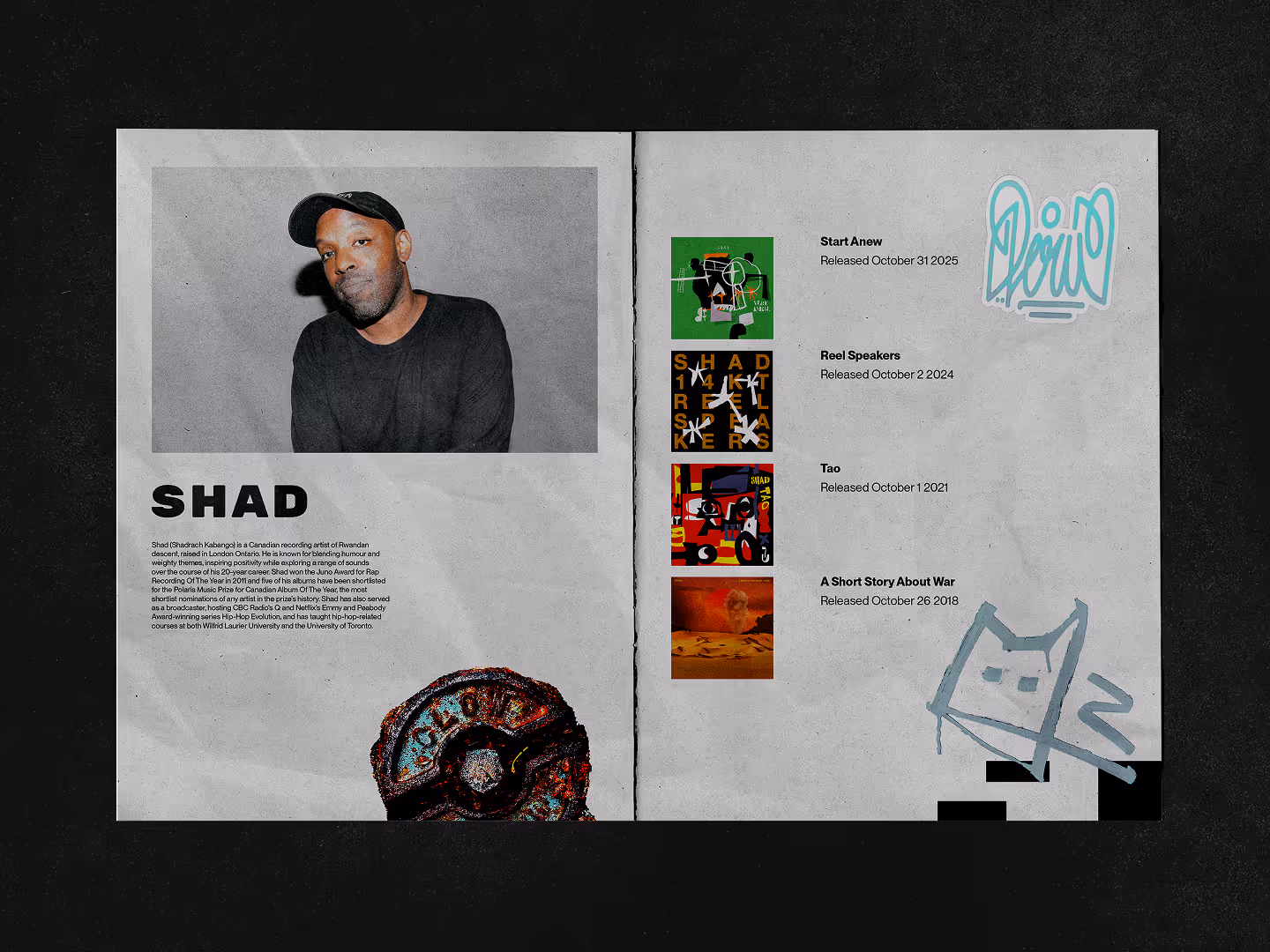
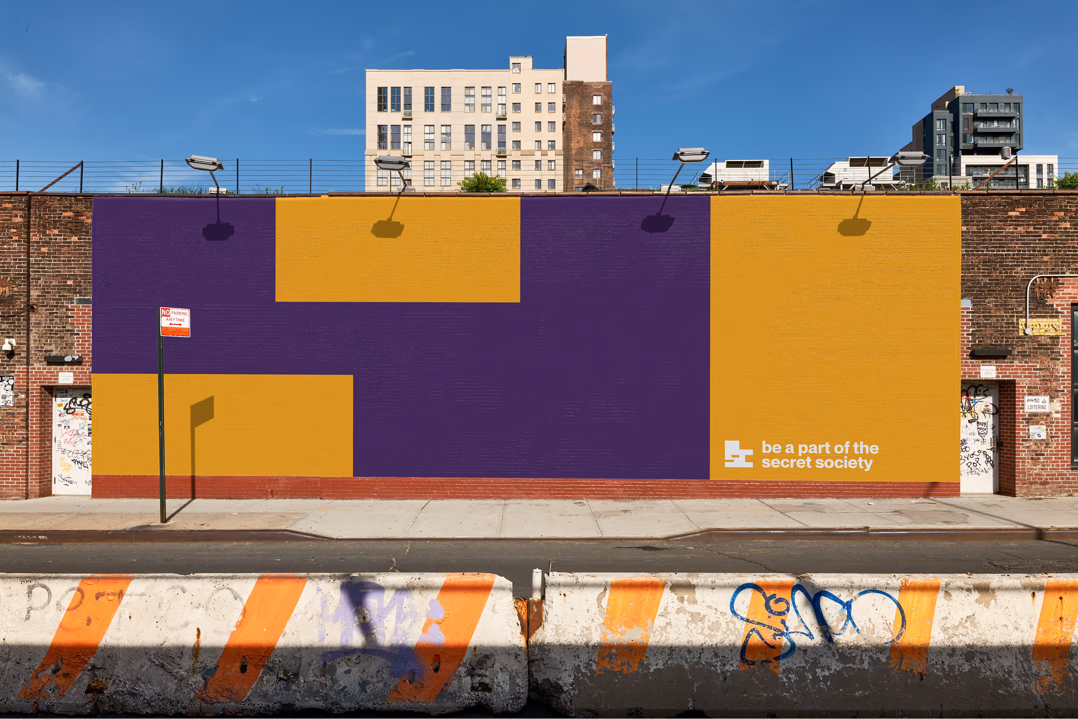
Creating a coherent visual system packed with personality
Secret City was founded in 2006, dedicated to developing and supporting artists with a strong creative voice across various genres. Their current business model includes working with musicians to produce and release their music, as well as providing support for live events and international partnerships. The goal of this rebranding project is to increase their brand awareness amongst young adults, and to create a flexible branding system suitable for a variety of use cases.